
We’re going to try a different way of trying to predict the Energy Production of a home solar panel. The technique I want to look at uses the seasonal_decompose function in Statsmodel python package.
However, to start it will help to see how the different houses compare across the months. I graphed each house’s energy production using the same x-axis of dates. The median is shown as the thick, red line.
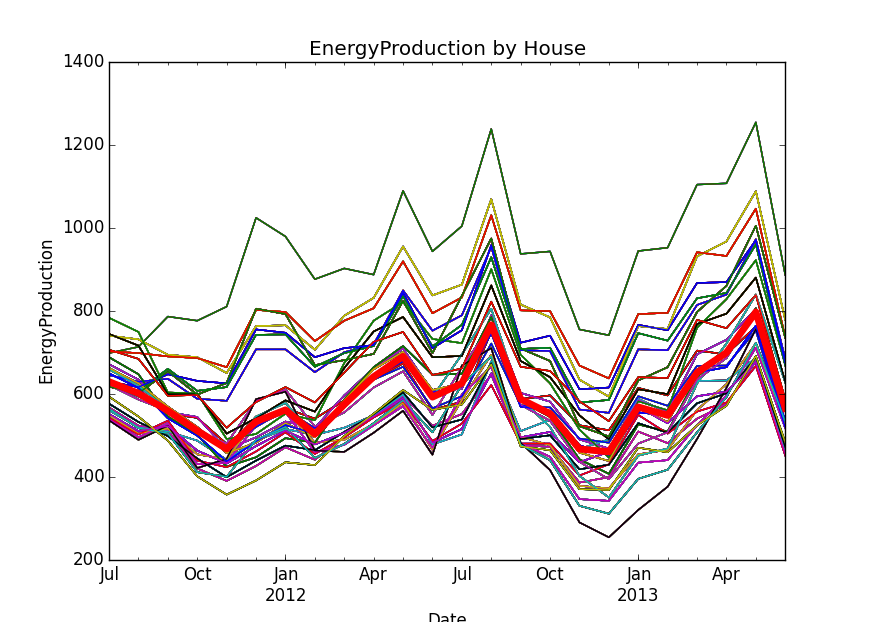
As you can see, every house seems to have a similar change in each month at its own level. However, it’s tough to get a trend out of this that would be useful in predicting future months.
Let’s attempt to break it down, though. We can use StatModel’s seasonal_decompose function to try and get a trend, seasonal, and residual component. Passing the median timeseries into the function is necessary because we can only give it one time series. The median will be less influenced by outliers than the mean because it only takes the middle value and not the weighted average. Although, in this dataset, it doesn’t seem to be much of an issue because of the lack of large outliers. Put simply, the seasonal_decomposition function uses a convolution filter to take out the trend. A convolution filter is a type of weighted average which not only looks at previous values, but also subsequent. After taking out the trend, it finds the seasonal pattern. This is essentially the averages for the particular periods. For example, the averages of all the Julys, the averages of all the Augusts, etc… What’s then left is the residual. The last component of what would make up the data.

The reason there is trend information lacking for 6 months on the ends is that the convolution filter uses an average of 6 months before and after the position. It runs out of data on either side. The useful information that pops out of these plots is the cyclical pattern of the seasonal information. EnergyProduction seems to be dependent on the seasons. This is similar to what we say when we broke the data down by months. Let’s see if we can make use of this.
I combined all the trend and seasonality components into one model. This model contains a sine function for cyclicality and a linear component for overall trend. I used the least square function from scipy to optimmize the parameters in the model function. This function requires initial guesses for which I used: constant = mean, linear component’s slope = slope of linearly fitted line, amplitude = 3 * standard deviation / sqrt(2), phase = pi/6. These seemed to be the most appropriate guesses that resulted in the best parameter estimates by the least square optimization.

The red line of the model shows a pretty good fit to the data, visually. A sinuisoidal component with a slight upward trend. Let’s see how it does on test data in predicting new data.

Very similar looking to the training data. However, this is not surprising since even the test data has 500 data points. The MAPE score comes out to be 19.1. This is a quite a bit worse than our previous best prediction of 12.48. most likely due to the fact that we are only predicting using the time component and not the additional factors of Temperature and Daylight that the previous model included. Still, makes for a good exercise for manipulating timeseries, breaking down components of the data, and fitting cyclical data.
References:
-GitHub Code: https://github.com/262globe/Blog.git
–http://stackoverflow.com/questions/26470570/seasonal-decomposition-of-time-series-by-loess-with-python
–https://searchcode.com/codesearch/view/86129185/
–http://statsmodels.sourceforge.net/devel/generated/statsmodels.tsa.filters.filtertools.convolution_filter.html
–http://www.cs.cornell.edu/courses/cs1114/2013sp/sections/s06_convolution.pdf
–http://stackoverflow.com/questions/16716302/how-do-i-fit-a-sine-curve-to-my-data-with-pylab-and-numpy
